

Artificial Inspiration
Written by
Melanie Wood
Exhibitions may come and go but the ideas they spark can still glow brightly long after the event has packed up and turned off the lights. With this quest for inspiration in mind, I headed to London’s Barbican Centre to check out AI – More than Human, which booted up its two-month run last weekend.
When it comes to driving the experience, fixed exhibitions seem to have the upper hand. They have a shelf life of far more than a trade show. Their budgets are hefty. There’s more time to plan and install. And, depending on location and venue, more chance to shine by using a variety of installations to tell the story. However, the creative principles they impart are free to takeaway and draw upon.
Artificial Intelligence is a hot topic. From helping big data create the bigger social picture, to smarter app algorithms in every part of our lives, AI means big opportunities for event design and engagement.
I took a look at the show, ably assisted by my 9-year old son, Olly, to demonstrate the interactions.
You can write a caption for images that would look like this
And so it begins
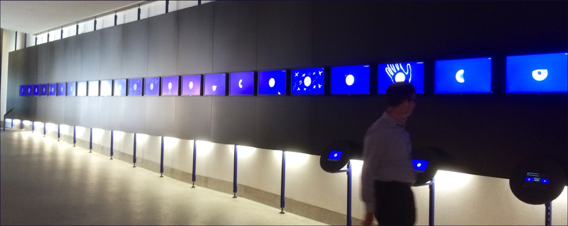
It’s true to say that a memorable event experience begins before you cross the threshold. This installation used giant screens to project your movements using an ever-changing digital character. This set up an interactive experience that puts you at the centre.
Actions Olly did when stood on the floor markings mirrored the actions on screen. The screen images changed, counting down with each new digital incarnation. Not only was the idea self-explanatory, it positively fizzed.
Takeaway – If you’re using tech, make sure you’re putting the user at the heart of the experience. Oh, and make it fun.Takeaway – If you’re using tech, make sure you’re putting the user at the heart of the experience. Oh, and make it fun.
Scale it up
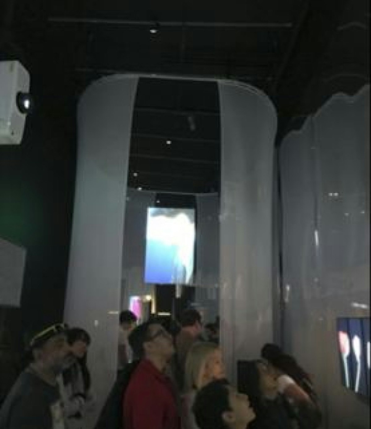
Making use of vertical space is always important across events, staggering the experience to take the eye high and low means more dwell time, more time to absorb.
It’s a simple optimisation with only a designated amount of floor space, constraints permitting. Draping designs that encapsulate the audience also add a sense of intimacy.
Takeaway – Keeping the eyes moving up and down adds dimension, and immersion.
Intimate experiences
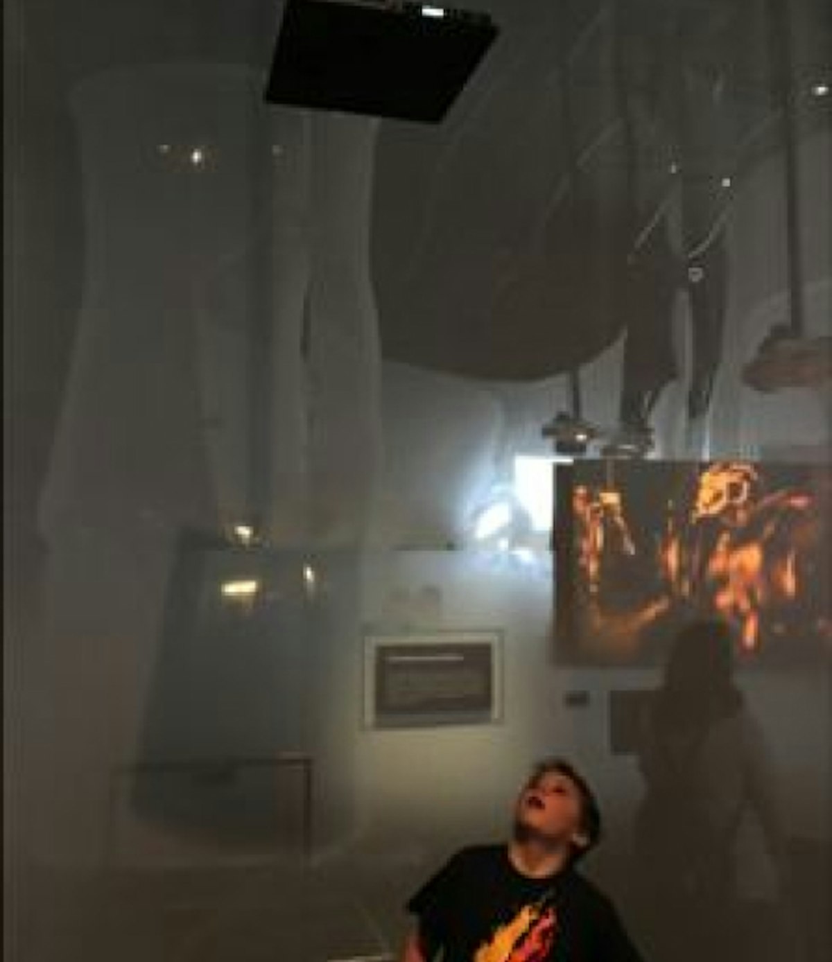
This drape-created booth used a speaker that broadcast soundscapes and messages, but only when we were directly underneath it.
With the combination of smart sound that segued in as we entered, it allowed focus – despite the noise outside the curtain.
Takeaway – Separating messages out and keying in audio increases the intimacy, impact and the memorability
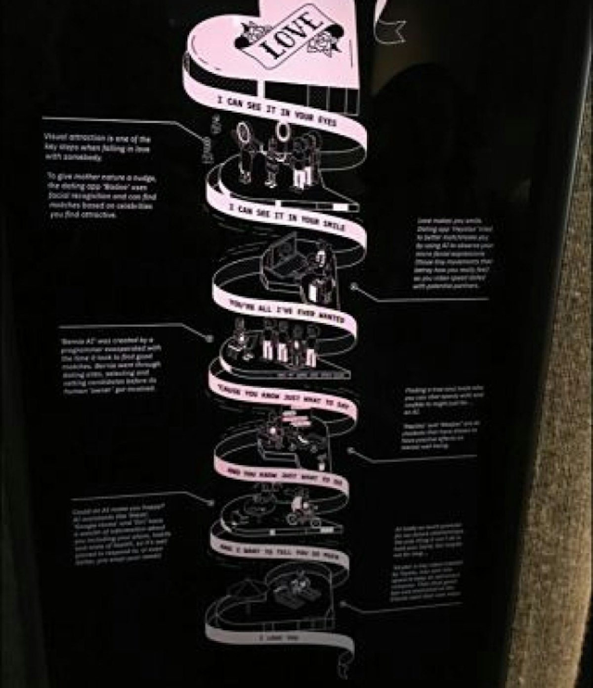
Schematics
Being playful doesn’t come at the expense of imparting the message when executed with charm. The right illustration style can make or break a message. Done correctly, it’s the chance to bring cultural reference points to otherwise one-dimensional information.
There was just a touch of animation here, but would have been effective with a simple backlit screen and a static image.
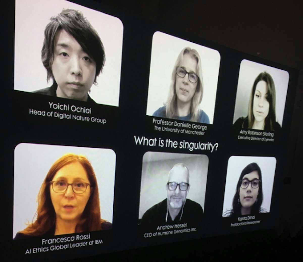
Land face up
We all understand the communicative power of the human face.
Even with a big theoretical construct such as ‘what is singularity?’, making the rendition compelling is centred in a very simple but quite brilliant way. It was fascinating to see each, live blinking, coughing, natural expressions on the faces – all experts in their field – listen and take turns while the other spoke.
It almost relayed the (quite terrifying) idea of singularity itself – the point where artificial systems supersede collective intelligence.
Takeaway – Use tech to turn live streams power up a notch. It doesn’t have to sophisticated AI, just a smart way of using what’s already available.
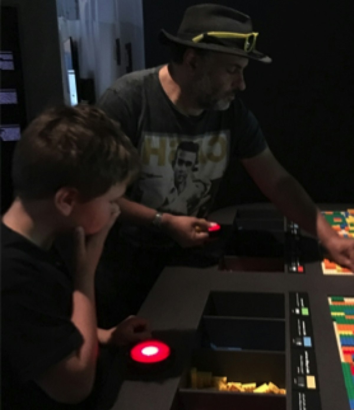
Go lo-fi. Go hi-fi
Mixing tactile and virtual makes for a compelling proposition.
In a virtual quest to build a perfect society, and to show the interplay of algorithms and real-life data, the installation involved placing different configurations of Lego bricks. Each represented different social factors, such as housing, green space, or jobs. Linked to the screen and read as code by the AI, you were given five ‘goes’ to get it right. Counter-intuitively, we didn’t believe this would work if this message was just digital.
Takeaway – Mix digital and analogue. The experience was incisive, smart, but tactile too.
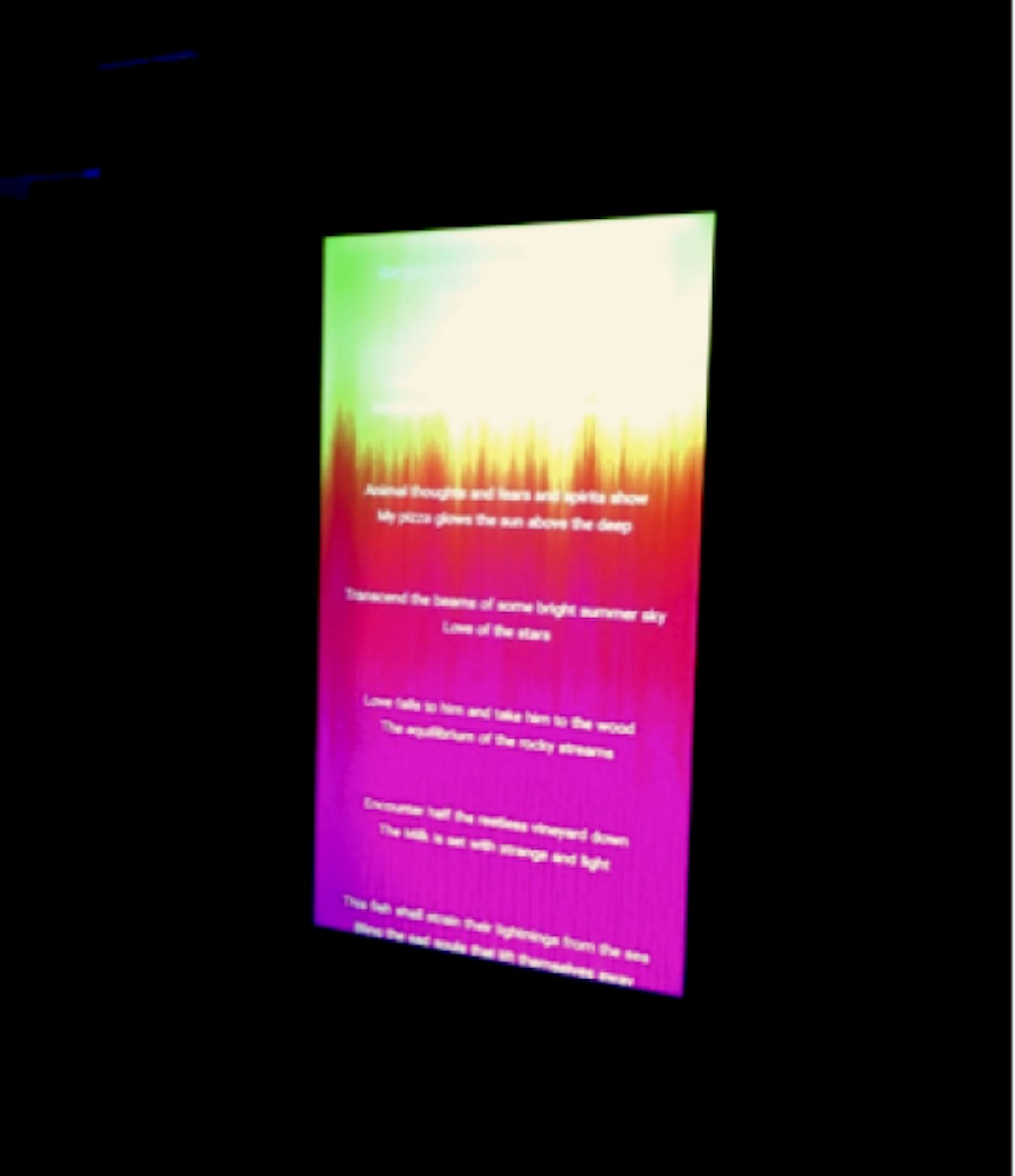
Be part of it
Despite having a few technical glitches (thanks Google), the booth showed AI’s – somewhat clumsy – ability to create poetry using a word you’ve chosen.
With a photo and the poem overlaid on the image, you then got a printed version to takeaway. The screen on the back showed everyone the poems that people had informed, the idea being that you’re part of it all, live.
Takeaway – Making people part of ‘it’ and giving them a present and post ‘memento’ completes the event experience.
AI is advancing and digital is always on the move. Terminator-like implications for society aside, there are big opportunities for more engagement, more quality interactions, and more prolonging of the experience.
If our visit to the Barbican is anything to go by, tech doesn’t always need to take up the whole stage at your event and will never replace the primacy of a great idea. But it helps land concepts in circuit-frying form.
